
from https://www.openculture.com/2014/02/kurt-vonnegut-masters-thesis-rejected-by-u-chicago.html
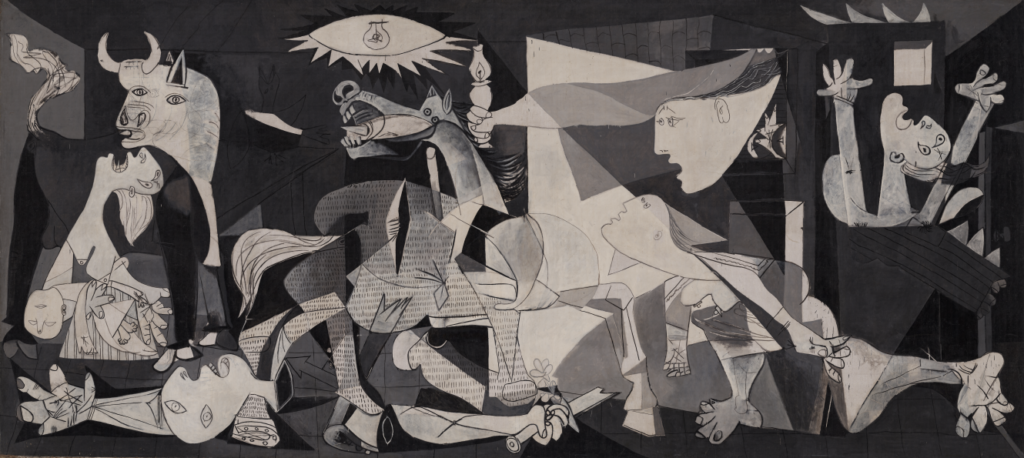
I wondered how the story analysis assignment might apply to an image, so I thought I’s give it a shot with Picasso’s Guernica. There are a few different stories here: the story the painting depicts, the story of Picasso making the painting, and we could even include the story of what the painting means to me. My grandfather was an artist and an art teacher, and I grew up with many of his old art books in my house. I was familiar with many famous painters at a very young age because these were the picture books I looked at. Picasso died when I was young as well, so he was in the news for a while. I didn’t get his work at that age, of course, but Guernica captured my attention because it is so visually striking. If I had to name a favorite painting at any point in my life, it would most often be this one.
There are a lot of stories about Picasso and the painting. I won’t go into any of that, except to say that my favorite anecdote is about a time when a Gestapo officer questioned him about it, “Did you do this?” Picasso responded, “No, you did this.”
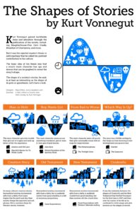
What is the story the painting tells, and how might it fit with Vonnegut’s shapes theory? It doesn’t neatly align with any one shape, but I could see connections to From Bad to Worse and Which Way Is Up? in the adjacent chart. We see confusion and destruction, products of war. I think confusion connects to Which Way Is Up?, although there is no ambiguity about good and bad here. And although we don’t see the before and after, we do see a transition where things get worse. If we try to read it visually, the proportions cause us to scan from left to right. The bull’s tail right at the beginning looks like smoke, an ominous start. We’re immediately confronted with screaming, death and dismemberment, and the cubist distortions emphasize confusion and pain. There are lines cutting across everything, so we don’t move through the image easily, and much of the activity and angles work against us, leading right to left as if the image wants to push us back. It looks like there’s a door on the right edge, but it’s not a way out as much as a portal into darkness – bad to worse. It tells a story, but there’s no resolution or relief in sight. You can get a good closeup of the painting and more information at Rethinking Guernica.
