
 I’m fascinated by Todd Alcott’s mashup/remix work and wanted to try something similar. I didn’t have an idea of what I wanted to do particularly, so I googled pulp paperback covers looking for inspiration. The Sailor’s Weekend cover caught my attention because I had been listening to Tom Waits the other day and thought of Shore Leave
I’d have to really rework the design to fit much of the lyrics in, so I just did the one verse.
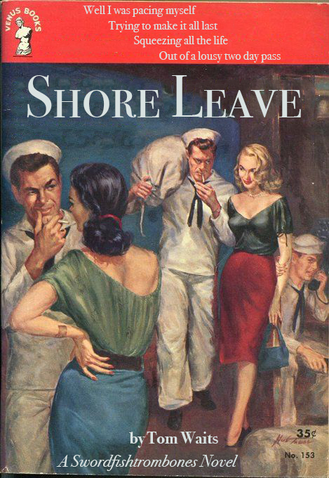
The first thing I needed to do was clear the type off of the image. Photoshop makes this relatively easy. I used the magic wand tool to select lines of type, then used the Select->Modify->Expand function to get an extra 2 pixels around the selection. Then I used the Edit->Fill->Content-Aware function to cover up the type. If I didn’t do the Expand, some of the type edges would show. As it is, you can still see artifacts of the photoshopping, but it’s not too bad. I used a Bodoni typeface because I’ve seen it on vintage paperbacks before. I think it’s a little too plain still, and the type could use some sort of aging effect to fit in better, but it’s OK as it is.

I tried another using this edition of Raymond Chandler’s novel, The Lady in the Lake. The image made me think of a William Shatner “song” I heard years ago, when he did his Has Been album. I used the same process to edit the image, and fit more of the lyrics in, but I think the typography needs more work.
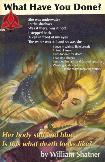
All of this verifies what I already knew, namely that this is harder than it looks. But I think if I match the right lyrics to the right cover, I can come up with something interesting
