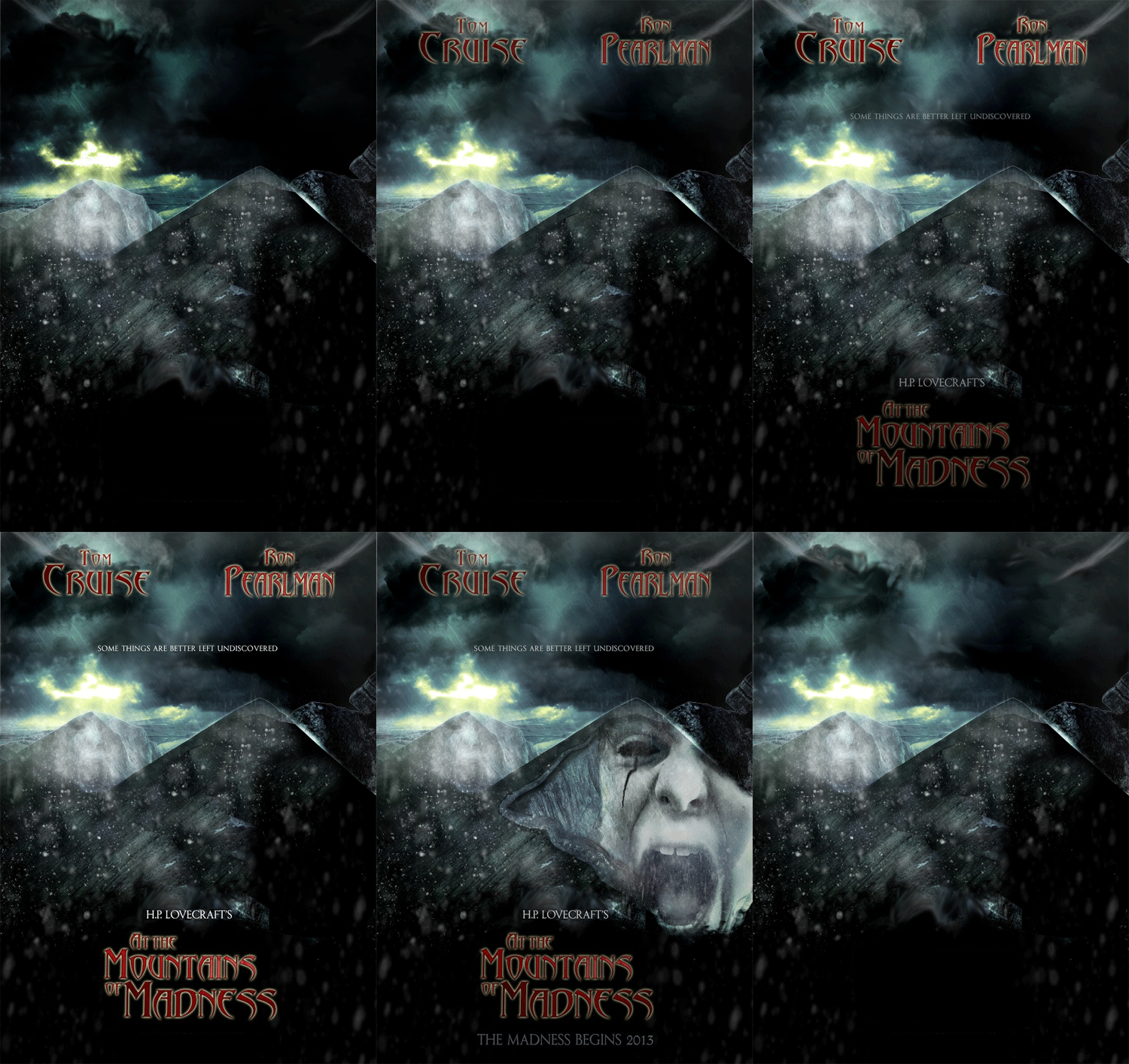
I found this through a google image search. Since it was posted on a discussion forum, I was able to contact the creator (stuart) for permission to molest his work. I’m not sure if this movie project is still underway, but that’s okay. I doubt it would have been an improvement on the book.
The first thing I do when working on something in Photoshop is duplicate the background layer, then hide the background by clicking on that eyeball thing. That way if I totally mess something up, I still have the original handy.
I don’t know how I’m going to animate it at first, but I think I could do something with the stormy sky and the text, and maybe that face on the mountain. So I start breaking the image apart. I carefully trace along the mountains’ edges and the upper sides and top of the image, so I have a sky/background selection, then copy and paste it on a new layer. I use the magic wand to select the blank part of the new layer, then select-invert and go to my background duplicate layer and delete the sky area. That gives me a foreground and a background on separate layers, but the image appears the same.
Separating out the type is a little tricky. I used the rectangle selection tool to copy each block of text and paste it on a new layer, and I tried to keep very close to the letters so I was only getting a minimal amount of background. But then I had to delete the type from the background. On the bottom part of the poster it was easy, because I could just fill my selection area with black. For the lines of type in the sky I would copy and paste bits of sky and use the clone stamp tool to cover the letters, then use the smudge tool to blend the hard edges. It doesn’t look quite right, but it’s passable.
I then decided to separate out the face image from the mountain. Trace the face, copy and paste, and then I had a face layer. To cover the face on the mountain layer, I filled the area with black, then I selected other parts of the foreground and copied and pasted them. The blurry snowflakes were helpful. I found that using the lasso selection tool with 10 pixels of feathering worked pretty well too. Feathering softens the selection edges so the bits and pieces blend better. I selected all the patch layers and the foreground and used the merge function in the layer panel to combine them.
It helps to name the different layers so I know which is which. I made a copy of the background and played with the layer adjustments – levels and so forth – to make a darker sky. I could use that for a lightning effect.
Once I had all the parts, I copied and pasted frames in the animation pane and experimented with turning layer visibility on and off. I tweened between some frames and let others flash to make it look stormy. I think it came out okay.


