
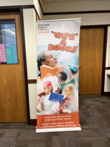
A few days ago, a new alleged reading promotion poster from the Chicago Public Library came to my attention.
I shared it with some colleagues, and one responded with this graphic.

Weeding is librarian talk for the process of removing outdated and unused books from the collection. But when I read “weed a book,” I hear it in Elmer Fudd’s voice.
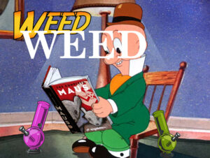 So this all made me think of the ALA Read poster series, which just happens to be a design assignment. I found a few images of Elmer reading, and played around with one, thinking about the poster series and the weed pun. Some of the posters use an Indiana Jones font, but I think the more classic Schoolbook font is more fitting. I thought about adding a pipe or two, going further with the pun. Since marijuana is becoming more legal, and some books are becoming less, I thought about incorporating that. I thought about using The 1619 Project, but that could be misinterpreted so I went with Maus. At this point I was just playing with ideas visually.
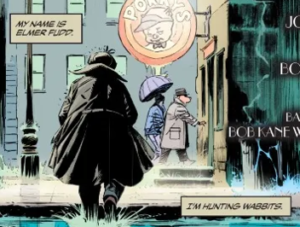
by King & Weeks, from Batman/Elmer Fudd Special 2017
As I thought about it more, it seemed that more subtlety was in order. I don’t need to spell out weed, because anyone who knows their Looney Tunes will get it from read, and anyone who doesn’t know about Elmer’s speech issues won’t get it anyway. With that in mind, the pipes were overkill too. I needed a subheading to highlight the legality issue though. I also need to make it look poster-like. My approach here was to use the Golden Rectangle for the dimensions. I made a new Photoshop image using those proportions, and pasted the Fudd picture in. I scaled it up to fill as much of the space as possible. It was still short, but the READ text filled most of the top part. I did some copy-paste work to extend the image upward. That was a bit sloppy, but it’s in the background so it’s not too distracting. I put in While it’s still legal! as a subhead. There were contrast problem with the image underneath, so I made a white copy of the subhead, applied a bit of blur, and offset it a little to make a white drop shadow, making it more legible. That didn’t fit well with the flatness of the READ headline, so I used an Emboss filter on it to give it some complementary dimensionality. I think it works. Some people won’t get the pot joke, but the right people will.

