
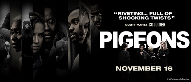
 I love the idea of a Pet Film Poster Mashup, yesterday’s Daily Create. I wasn’t really sure what to do for it though. I don’t have a pet of favorite animal, unless the Guinea worm counts. So I started thinking about movies and movie posters, but quickly realized that there were too many of them. Then I googled “top films of 2018,” and one of the titles that came up was Widows, which was really good, and had a cool poster. As a bonus, the way the poster was designed would make it easy to swap in an animal. The next step was to figure out what animal to use. I remembered to pigeon picture from an old listicle, one that I liked enough to make my desktop wallpaper.
To make them work together, the pigeons would need to be grayscale. I went to the Hue & Saturation function under the Image->Adjustments menu, and slid the saturation all the way down. I also tweaked the contrast a bit (Ctrl-L) to make it a little darker to fit in with the poster. I went to the poster and made a duplicate layer, then cut out some of the characters. I copied the pigeons picture and pasted it in the poster, and moved it behind the duplicate layer, and lined up some pigeons in the openings. They didn’t just all fall into place so I had to do some duplication and trimming to get the pigeon faces where I wanted them. You will notice that all the faces have a kind of a spotlight on them, so it fades to black at the edges. I needed to simulate that effect to really make the birds fit. I changed the rectangular selection tool to elliptical and set the feathering at 20 pixels, and then selected around each pigeon head and filled the background with black. The feathering gave it the gradation to fade to black and the elliptical selection acted as a spotlight. I took it a step further and re-did the title. I used Arial Black to get the heavy letters, and made some adjustments to the letterspacing and horizontal scaling to get it to fit and look right. The I used the polygonal selection tool to copy the characters and paste them in front of the type. I used the magic wand to grab the “Widows” letters and fill them with black.
That’s probably a little overboard for a Daily Create. Because I have some experience with Photoshop, I knew how to do what I wanted to do, mostly, so I didn’t do much trial and error experimentation. In hindsight, I think changing the title was a step too far, and it cost the image a lot of subtlety. I could have made some sort of pigeon pun with the other text. I also notice that the poster isn’t really grayscale, but rather has a dark sepia cast, so I should have done something to make the pigeons fit better. Live and learn.
