
Yesterday’s Daily Create challenge was to make an infographic of a song. I had seen people do this before. My personal favorite was the flowchart for Devo’s Whip It.
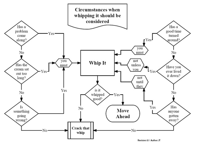
Unfortunately I don’t know who gets credit for this. I knew there was no way I could come close to that brilliance, but I thought I could tap into someone else’s brilliance:
When it comes to over-acting, few could match Shatner in his prime. The way he mugs for the camera in this video can make people laugh and cringe at the same time. And it has numbers, so it can be graphed. I thought about how to do it, and ended up putting it together in PowerPoint. That way I could hyperlink the datapoints to specific times in the video, and upload it to Google Slides for embedding online. It started as a straight chart, but then I thought it was a little bare so I stuck his face in the background. It’s still pretty lame design-wise, but it’s a quickie. There’s nothing to suggest that you should click on the datapoints – maybe a roll-over behavior would help – but then again I’m not sure the links serve any real purpose.
The concept would make for a good design assignment though. If it’s not in the Assignment Bank already, I may have to put it there.
