
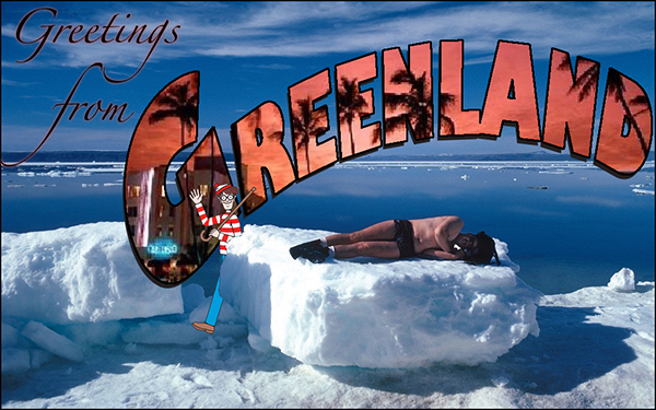
 I watched the Midnight Sun episode and thought about what kind of assignment could go with it. Splash color on one of the paintings? Maybe, but I did something like that already. I thought about the radio guy doing the weather and how that might be a nice audio assignment – something like, “Do a radio weather report, but make it colorfully descriptive.” But then I decided to look through the design list to see what was there. I thought there was a travel poster assignment. I could do Visit Sunny Alaska! I found the Greetings from DS106 assignment and clicked the remix button and got a Where’s Waldo? card. That had possibilities.
I did a Google image search for Greenland and found the picture of the swimsuit guy on the ice block. Another search found a good picture of Waldo. I did a third search for “greeting from” pictures, mainly for font inspiration. That gave me the curved type idea. There’s a way to do that in Adobe Illustrator by creating an ellipse and using the path type tool. I used Gill Sans Ultra Bold because it has those really thick strokes, which are necessary if I was going to try to do that image-inside-the-letterform thing. I saved the Illustrator file, opened up the Greenland photo in Photoshop, and used File-Place to bring in the type from Illustrator. I opened up the Waldo image and used the magic wand tool to select the white background, then did Select-Inverse so that I had just Waldo, and copied and pasted him into the Greenland picture. He came in about the size of the Statue of Liberty due to the difference in pixel dimensions, so I spent quite a bit of time resizing him. When I had him at the right size and place, I made his layer invisible and used the polygonal selection tool to trace around the ice block where he overlapped, then turned the visibility back on and deleted that chunk of him so it looks like he’s coming out from behind it. I wanted to play on that temperature inversion idea from the episode so I did another search for images of Miami Beach. I pasted the Miami picture in as another layer, sized it, then made al the layers invisible except for the Greenland curved type. I used Select-Color Range to get the black type, then switched to the Miami layer, made it visible, all while keeping the Greenland selection outline, and copied and pasted that portion of the image as a new layer. I moved it slightly to get the drop shadow effect. I needed to make the upper edges of the letters a little more solid, so I used the magic wand/Select-Inverse trick again to get the type, then did Edit-Stroke to put a black line around the letters. I stuck the “Greetings from” in the corner in a font called Zapfino and moved the “from” so the ascender flows into the descender on “Greetings.” I flattened the layers and saved it as a JPG 600 pixels across. It could use more work – I think the type could be more legible – but I don’t feel like going further right now.
Whew! I think typing this up was more work than making the design.
